MDT | Pre-Awakening UI Health & Ammo

Health/Heart
...when the beat drops i'm going to fucking kill myself...
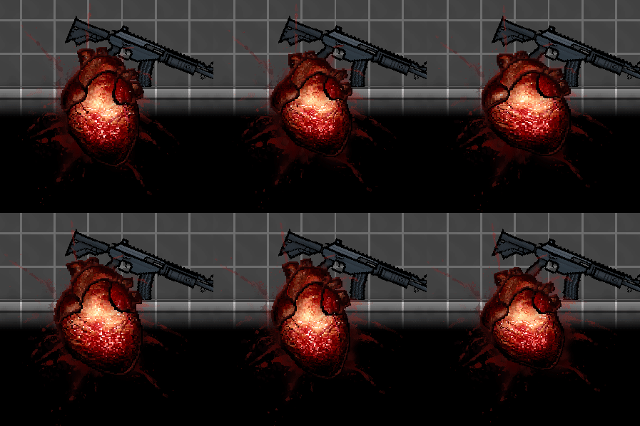
During the last 2 streams i've been making a way to display player's health without actually telling the numbers. I needed a vague but at the same time easy to understand depiction of how close you are to dying.
Art:
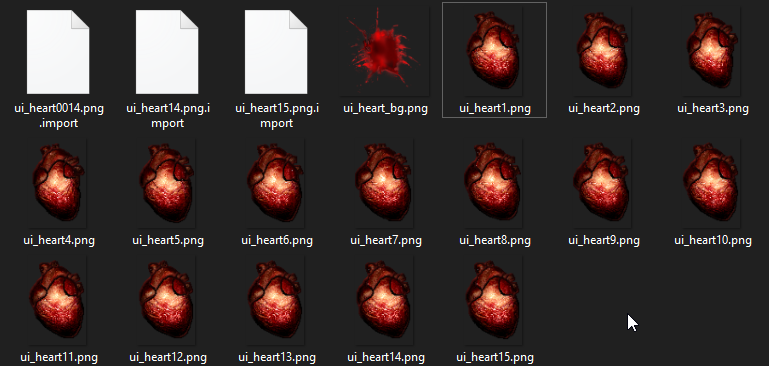
Being inspired by the grittiness of Postal 2's UI and the general aesthetic of the game (compressed realistic images) - an idea of a realistic beating heart sparked almost immediately. So off i went, tracing and drawing over a random animation i found on YouTube. I lovered the fps to about 10, and even after that deleted a bunch of frames, and finally i ended up with 15 sprites of the animation (and a blood splatter to go behind the heart)
Functionality:
Having just a single animation of the heart would be pretty boring, so i decided to add a bunch of "floating" animations. Squishing, shaking, rotating, scaling up and down - all of this was combined with a timescale node to make it go faster the lower health you have. It also becomes much "redder" the closer you are to dying.

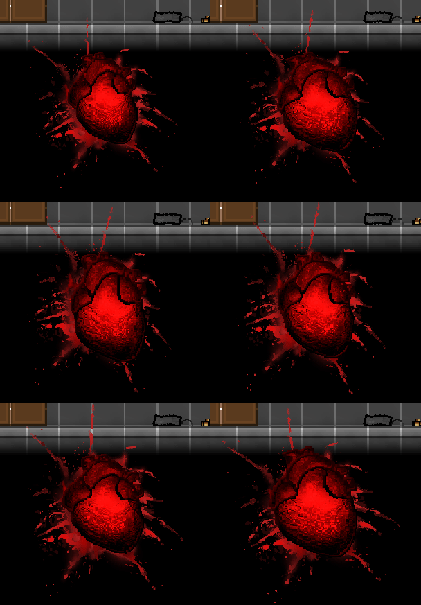
Health at it's max and close to 0 value.
There is also a heartbeat sound playing. It gets more and more louder and distorted the less health you have. And to make it less painful the sound fades away after 2 seconds of not taking any damage. I can't upload audio on itch.io so you gotta watch the streams :3.
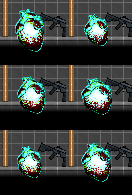
Cool bug!
There is a bug for when your health exceeds the maximum by a large amount. For example here i have 9000 health, while the maximum is 300, and because of how colors work (the opposite of red is light blue, so here instead of getting redder it does the opposite thing) it makes for some sort of a ÜberCharge effect.

I don't know if this will have an actual place in the game, but it is a cool effect nonetheless. Not planning on fixing such cool artefacts.
Ammo combo
...11, 12, 13, 14, fuck.., 1, 2, 3, 4...
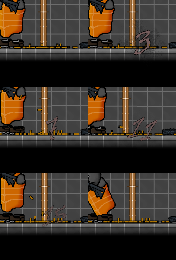
With this one i actually had a bit of trouble with ideas. But thankfully, one of my friends came up with one. A combo counter, like in fighting games, where every time you make a shot it counts and resets after some time. I liked this idea a lot over some other variants and it was surprisingly easy to implement.
Art:
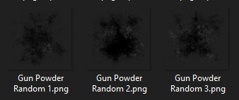
For art there wasn't much. I knew i needed some sort of a background for numbers like the one behind the heart, so a gunpowder cloud is what i came up with.
Also i needed a font for this. I've already settled on Homespun before, but that font is reserved for computer interfaces, which your player will not have until after the intro, so i needed some sort of a "organic" or a "hand-drawn" font.

Functionality:
It's simple, you shoot - it counts. After the animation ends the counter resets. And that's basically it. Because of how simple it is i needed a way to make it look more complex/cool. So i settled with a Hotline Miami thing where the text "explodes" when you earn points.
I'm very happy with the result, considering how easy it was to implement =D
Conclusion
Not much is left for the ui (weapon inventory and death screen), and i don't think im going to update it before DEVLOG 1. I say this at the end of every stream and will keep saying it - i love how with each small thing the games looks more and more like an actual game.
Tune in later!
Misc. stuff
Streams:
These are the livestreams where all of this was developed:
Get MDT: Make it or Die Trying
MDT: Make it or Die Trying
/romantic/violence
| Status | In development |
| Author | solidp_ |
| Genre | Action, Shooter |
| Tags | 2D, Atmospheric, Gore, Post-apocalyptic, War |
More posts
- A-EtY | Supporter Build 85 days ago
- Devlog #4 | August Public Build82 days ago
- Melee | Supporter Build 7Jul 15, 2025
- Augment | Supporter Build 5Jun 14, 2025
- Volatile | Supporter Build 4May 14, 2025
- Devlog #3 | April Public BuildApr 15, 2025
- Surface? | Supporter Build 3Mar 14, 2025
- Guard Up | Supporter Build 2Feb 14, 2025
- Throwing, Slashing, Bleeding | Supporter Build 1Jan 14, 2025
- Devlog #2 | December Public BuildDec 12, 2024


Leave a comment
Log in with itch.io to leave a comment.